An open application, designed for musicians
Opening the programme meant musicians without a nomination would meet Classeek through a form. Clear requirements up front, links instead of heavy uploads, and a review before paying.
Website · application flow · visual identity
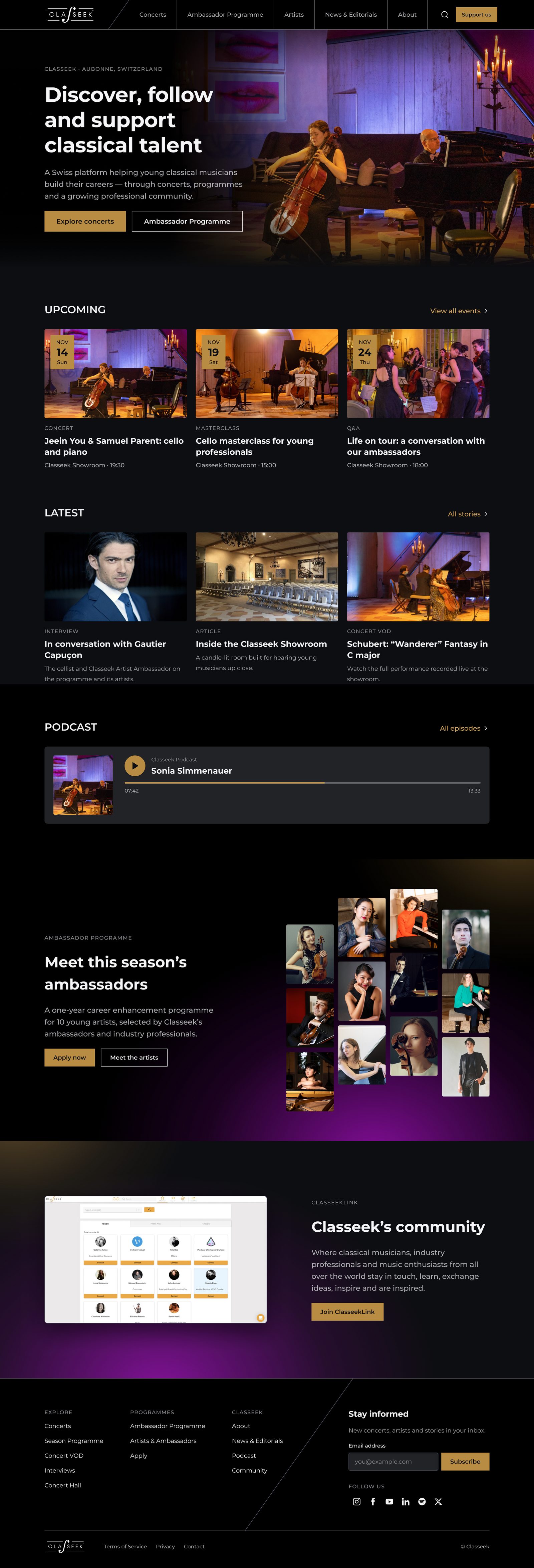
Screens are a 2026 refinement of my original designs, rebuilt in Figma. Classeek's live website has changed since. Click any screen to see the full page.
Classeek had outgrown Wix. The team couldn't manage content on their own, and the Ambassador Programme was about to open to applications.
Structure, UX and UI for the new website, a five-step application flow, and a dark visual identity inspired by Classeek's showroom.
Classeek's in-house developers built the new site, and the team was very happy with it. Musicians without a nomination could now apply.
The problem
Classeek supports young classical musicians through programmes, opportunities and a professional community. Its website was on Wix, and as the company grew, the platform became restrictive and hard for the team to manage on their own. Classeek now had its own developers, so it could build something more flexible in-house.
This was a chance to do more than refresh the visuals: to rethink how Classeek presents itself.
The site had to say who Classeek is, show its concerts and artists, present the Ambassador Programme, and let the team publish concerts, newsletters and articles themselves.
It had to do that for a mixed, international audience, and still feel like classical music.
The team
Classeek's team was spread across Switzerland, Poland and Israel. We worked remotely in short cycles, with design, product and development in the same daily conversation.
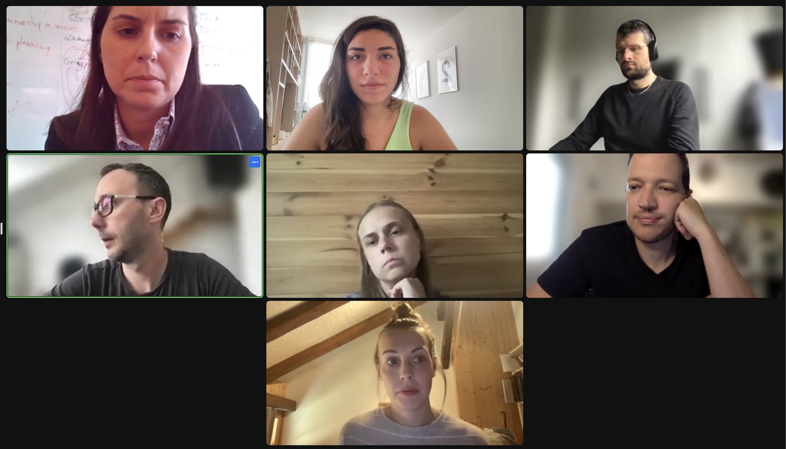
![A Jira ticket on the Classeek 2.0 Kanban board: '[BE] onboarding – profile setup step 1', with notes that refer to the designs.](assets/jira.jpg)
The core idea
Cool, but still classical.Classical music doesn't need to lose its identity to feel current. It can sit alongside nightlife energy, technology and a younger audience.
Design direction
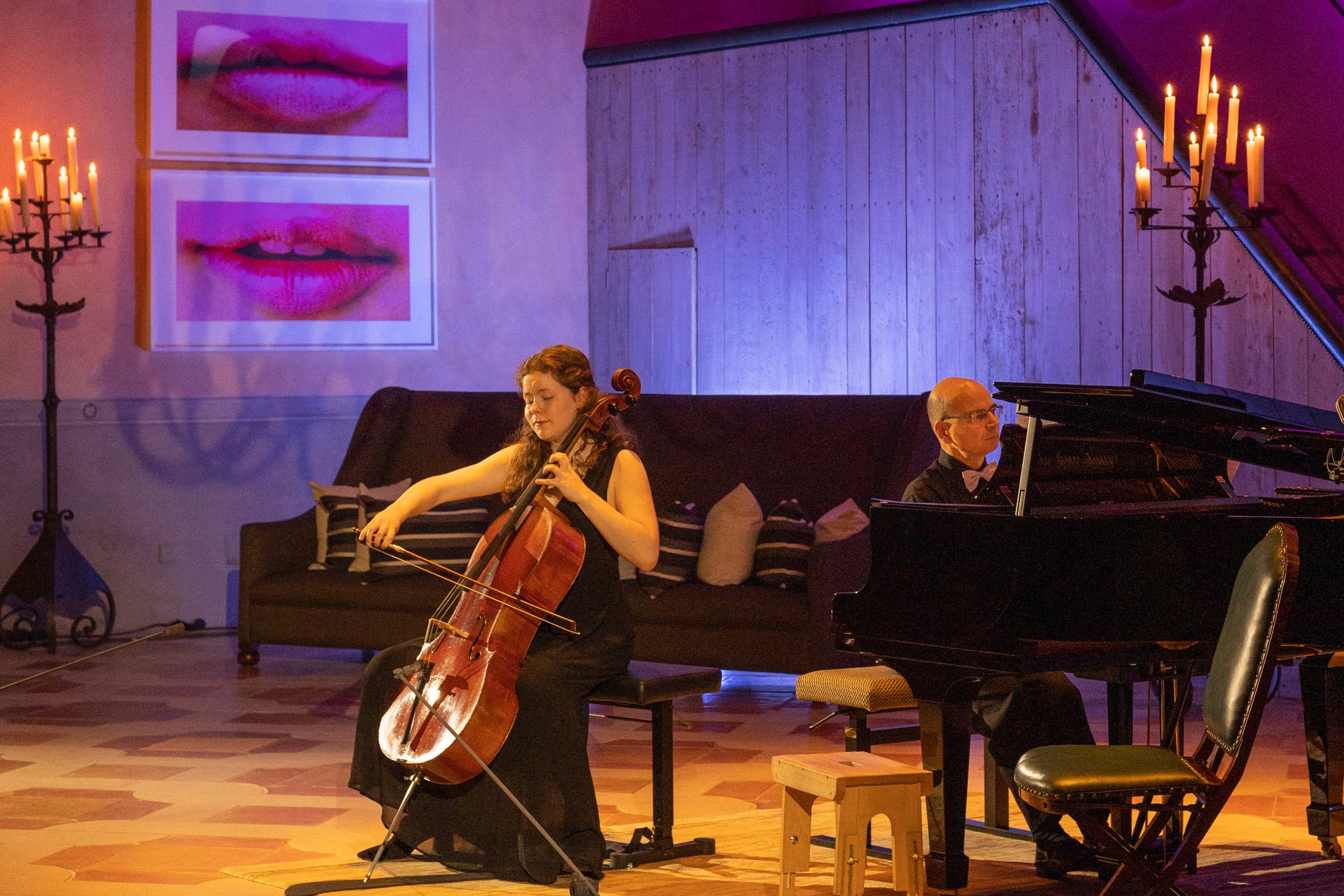
The showroom was lit only with colorful lights. They created gradients on the walls and gave the room a more modern feel. I took the colors and the vibe from the showroom and used them for the website's color system and its gradients.
That's also where the dark foundation comes from: the choice was inspired by the showroom's atmosphere.
#18191E background, black bands, #292929 surfaces#F5F5F7 text, greys for hierarchy and linesA dark site has to earn its contrast. I checked every text color against the background it sits on. All of them pass WCAG AA (4.5:1). The darkest grey is kept for borders and dividers only.
| Pair | Use | Contrast | AA text |
|---|---|---|---|
| Aa#F5F5F7 on #18191E | Body text | 16.1 : 1 | Pass |
| Aa#AEAEB2 on #18191E | Secondary text | 7.9 : 1 | Pass |
| Aa#8E8E93 on #18191E | Tertiary text | 5.4 : 1 | Pass |
| Aa#D8A85D on #18191E | Links | 8.1 : 1 | Pass |
| Aa#0D0E11 on #B88C42 | Button label | 6.3 : 1 | Pass |
| Aa#636366 on #18191E | Borders only | 2.9 : 1 | Not for text |
Enrollment flow
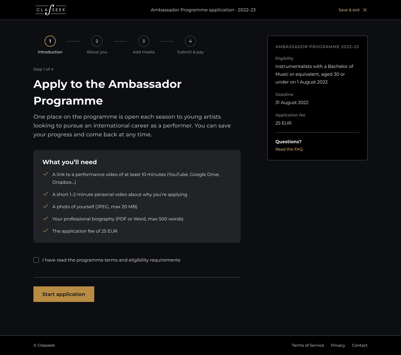
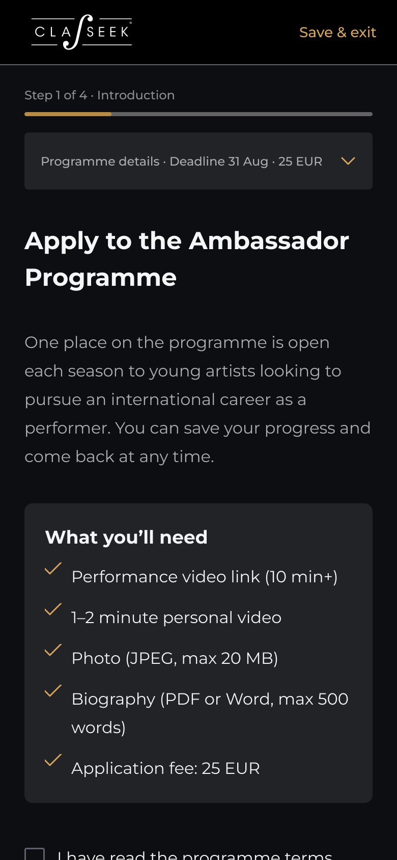
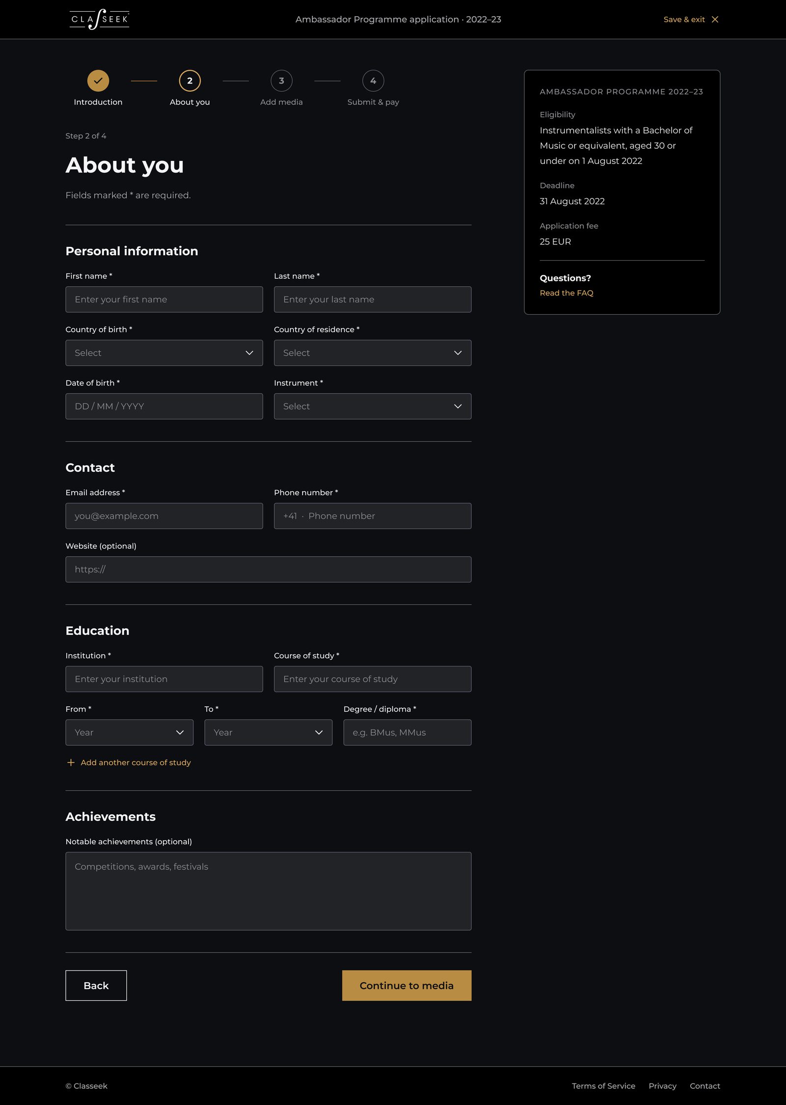
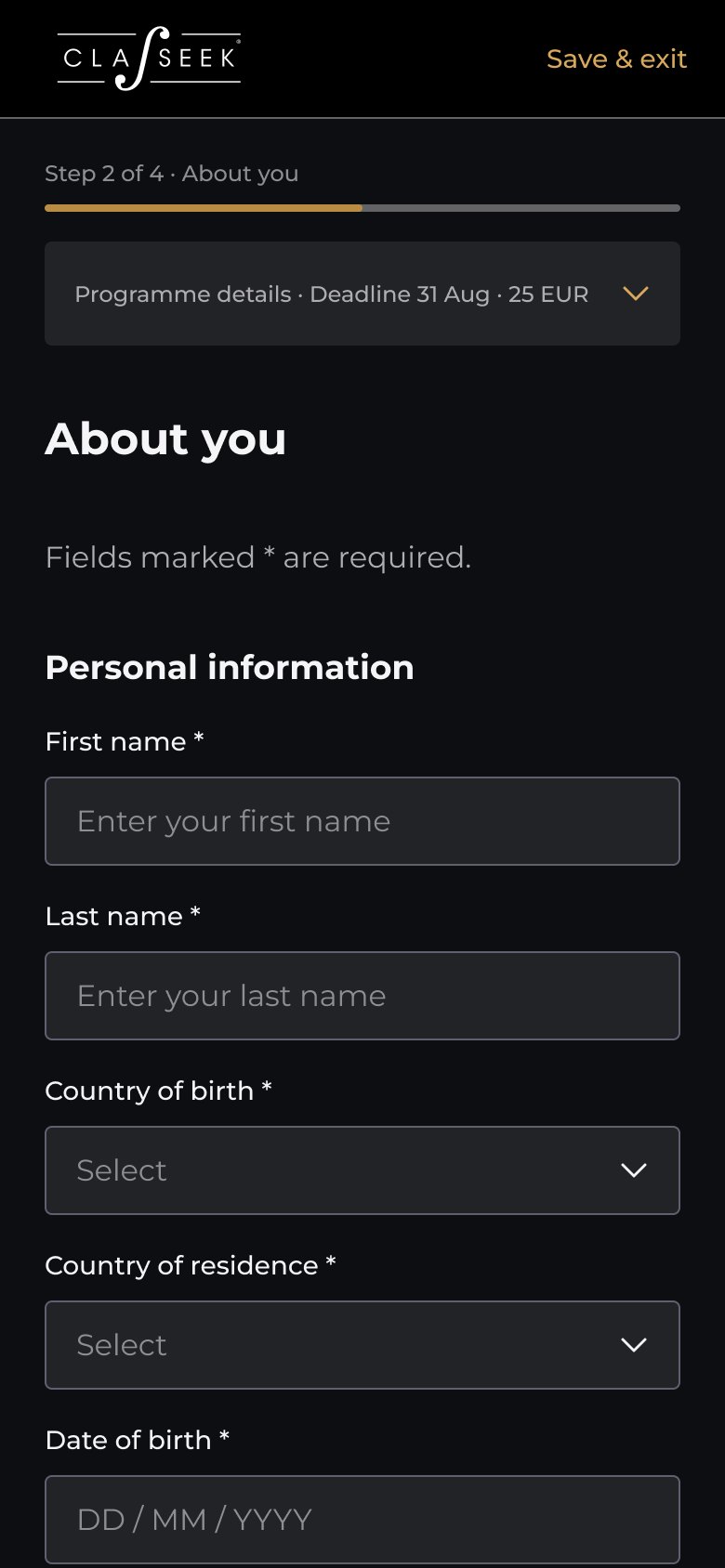
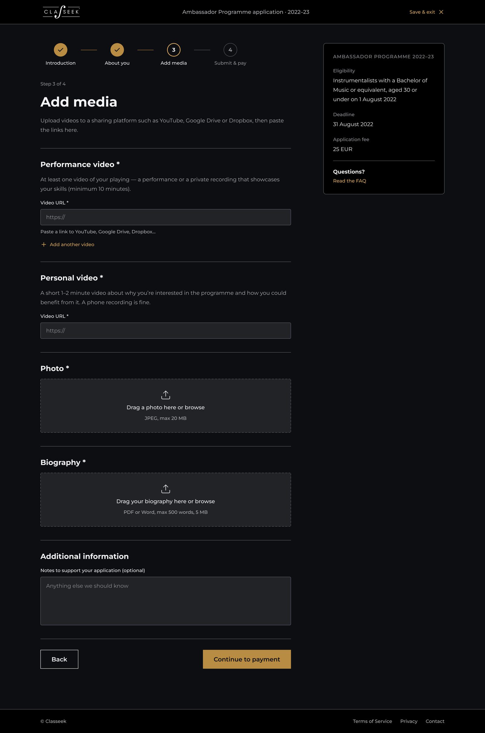
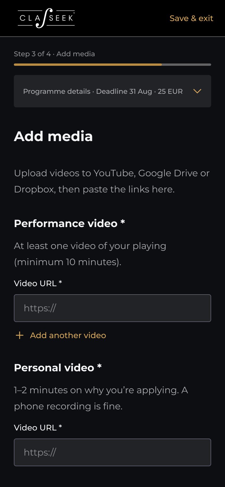
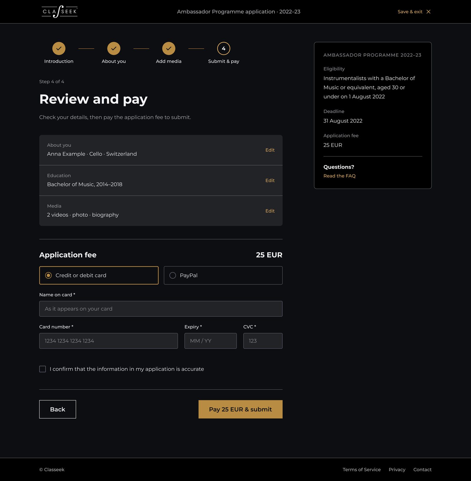
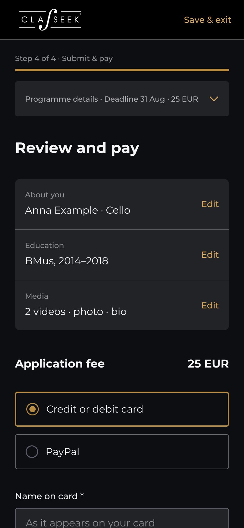
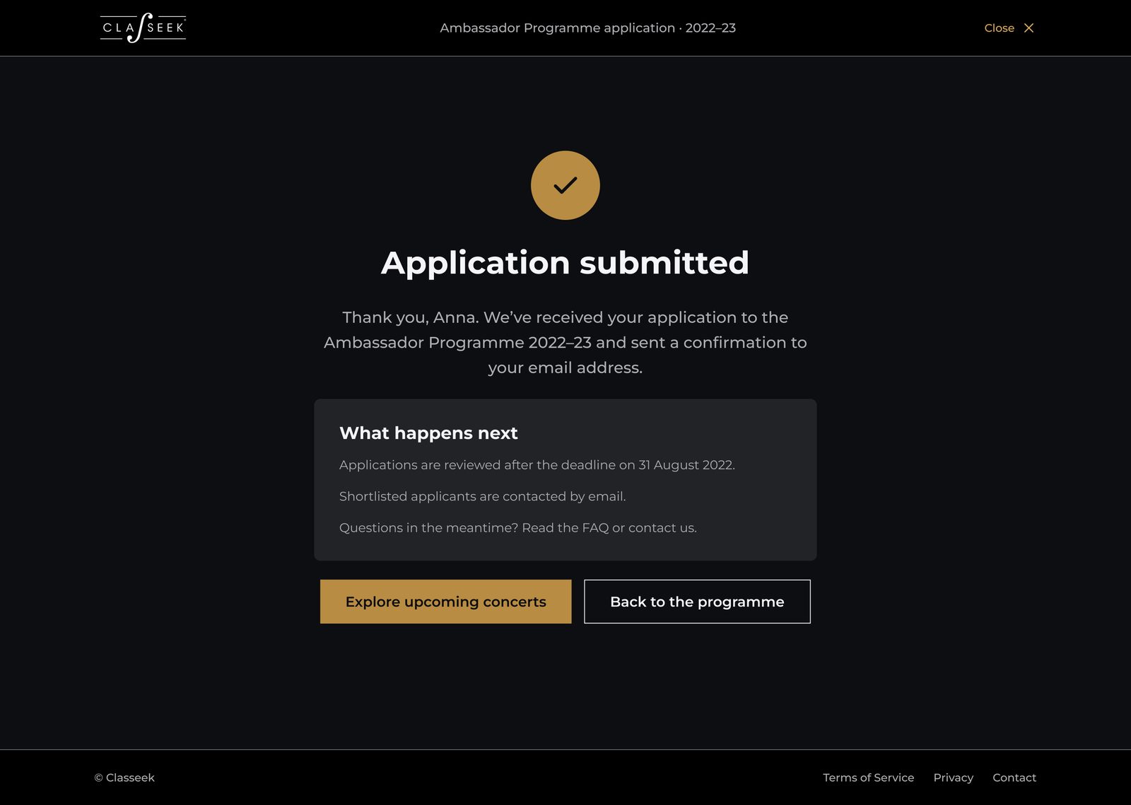
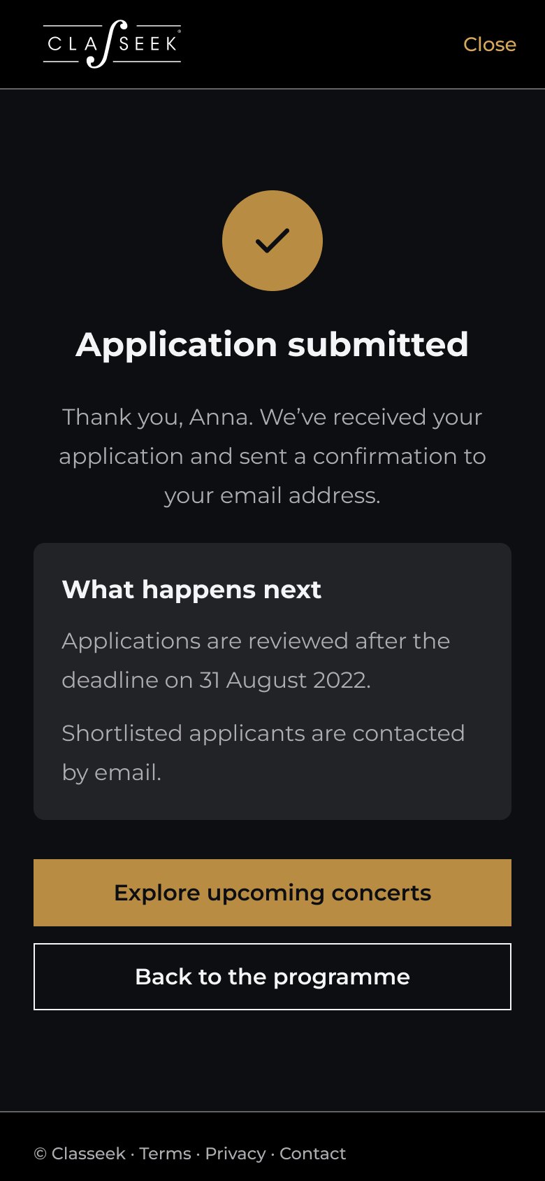
The Ambassador Programme, founded in 2018, is a one-year career programme for young classical musicians. Until then, the only way in was a nomination by one of Classeek's Artist Ambassadors. Classeek then opened one place per season to young artists worldwide, through an application. I designed that path, from discovering the programme to submitting.
Step 1 of 4
Step 2 of 4
Step 3 of 4
Step 4 of 4
Done
The website
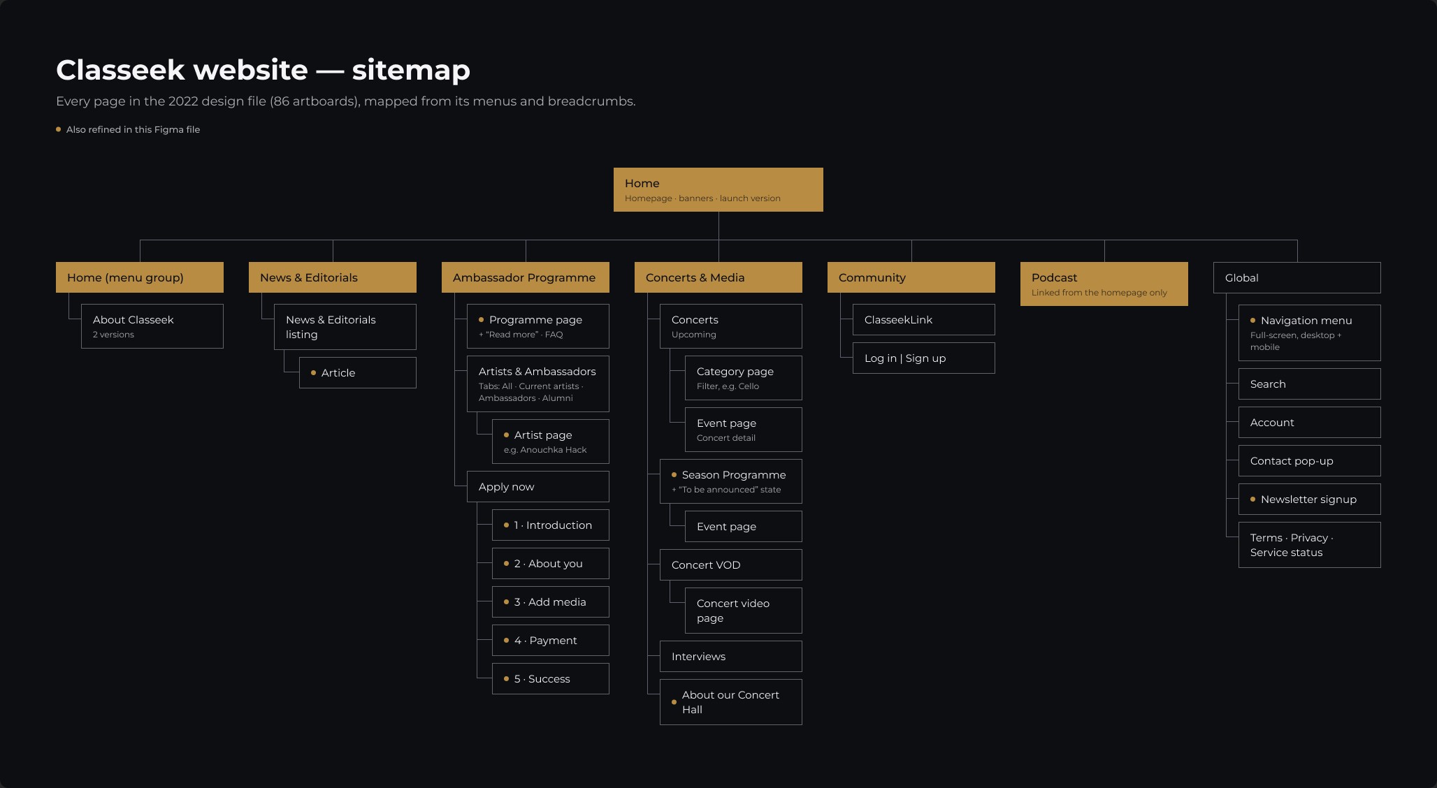
I mapped every page of the original design file, 86 artboards in total, into one structure. The pages below are the ones that carry the brand and the business.
Structure
News, the Ambassador Programme with its application, concerts and media, the community, the podcast, and global pages like search and the newsletter. The dots mark the pages refined for this case study.
Home
Upcoming concerts, stories, the podcast, this season's Ambassadors and the community each get their own band. The violet glow is saved for key bands like the Ambassadors, so the rest stays calm.
Ambassador Programme
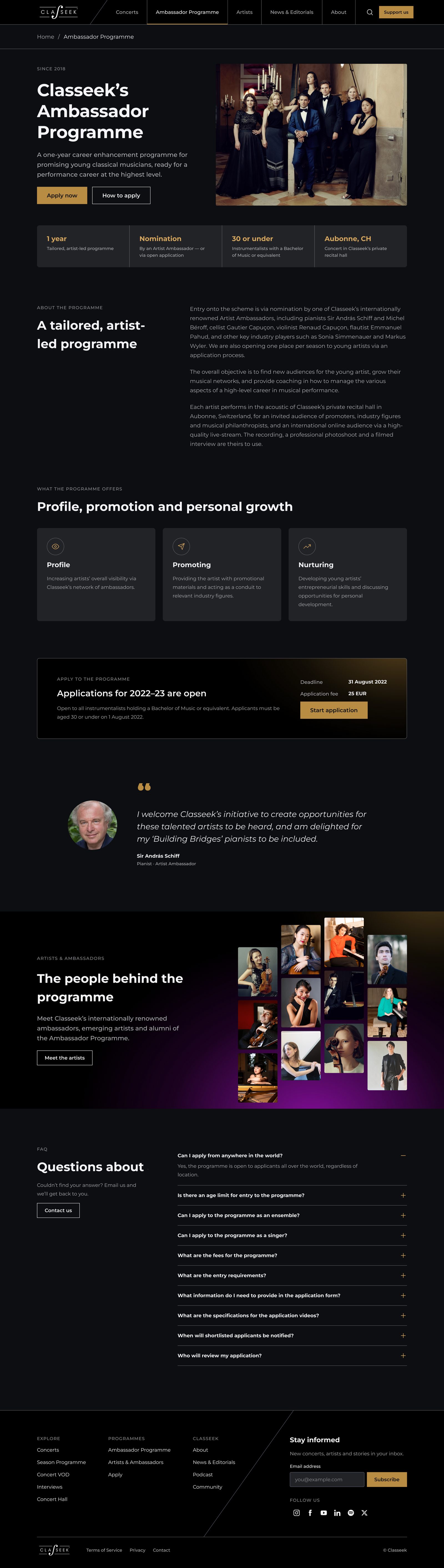
The key facts sit in one strip under the title: one year, entry by nomination or application, 30 or under, based in Aubonne. Further down: what the programme offers, the people behind it, the deadline and fee, and a FAQ.
Season Programme
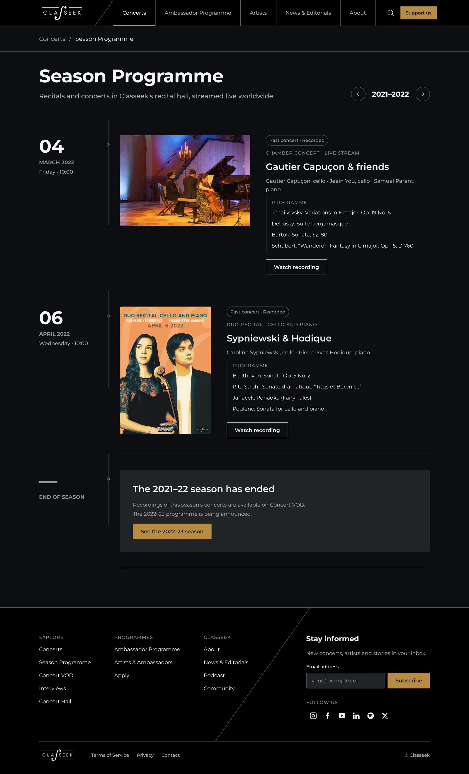
The season reads as a timeline: date, performers, full programme and, for past concerts, a link to the recording. The banner is Classeek's original poster for the 6 April 2022 duo recital.
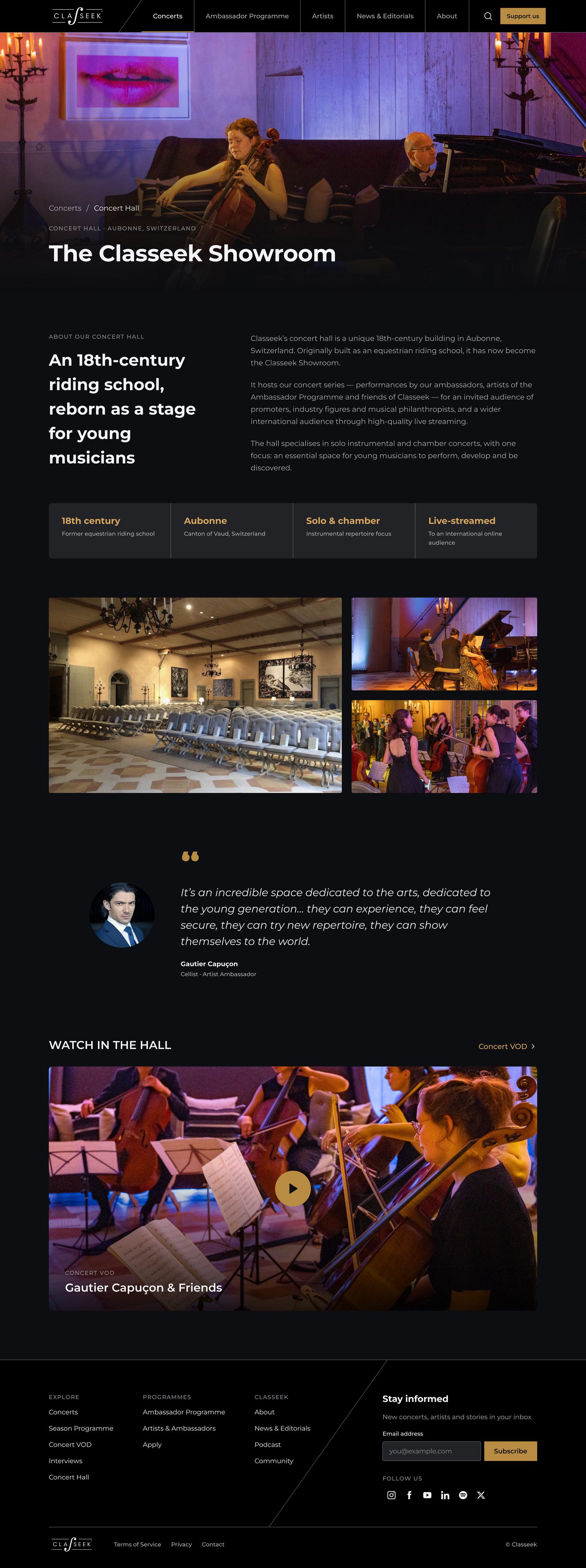
Concert Hall
The same room that inspired the color system: photos, key facts and recorded concerts from the hall.
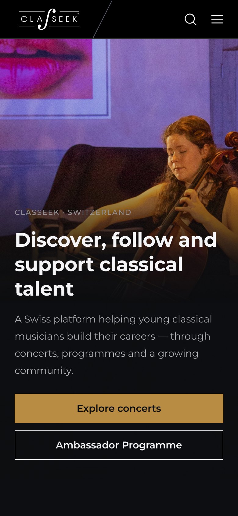
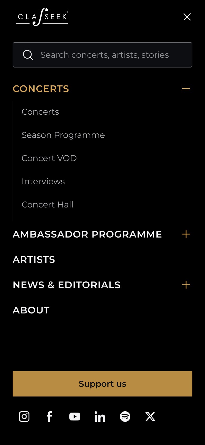
On mobile
Every refined page has a mobile layout. On phones, a full-screen menu carries the navigation.
Design system
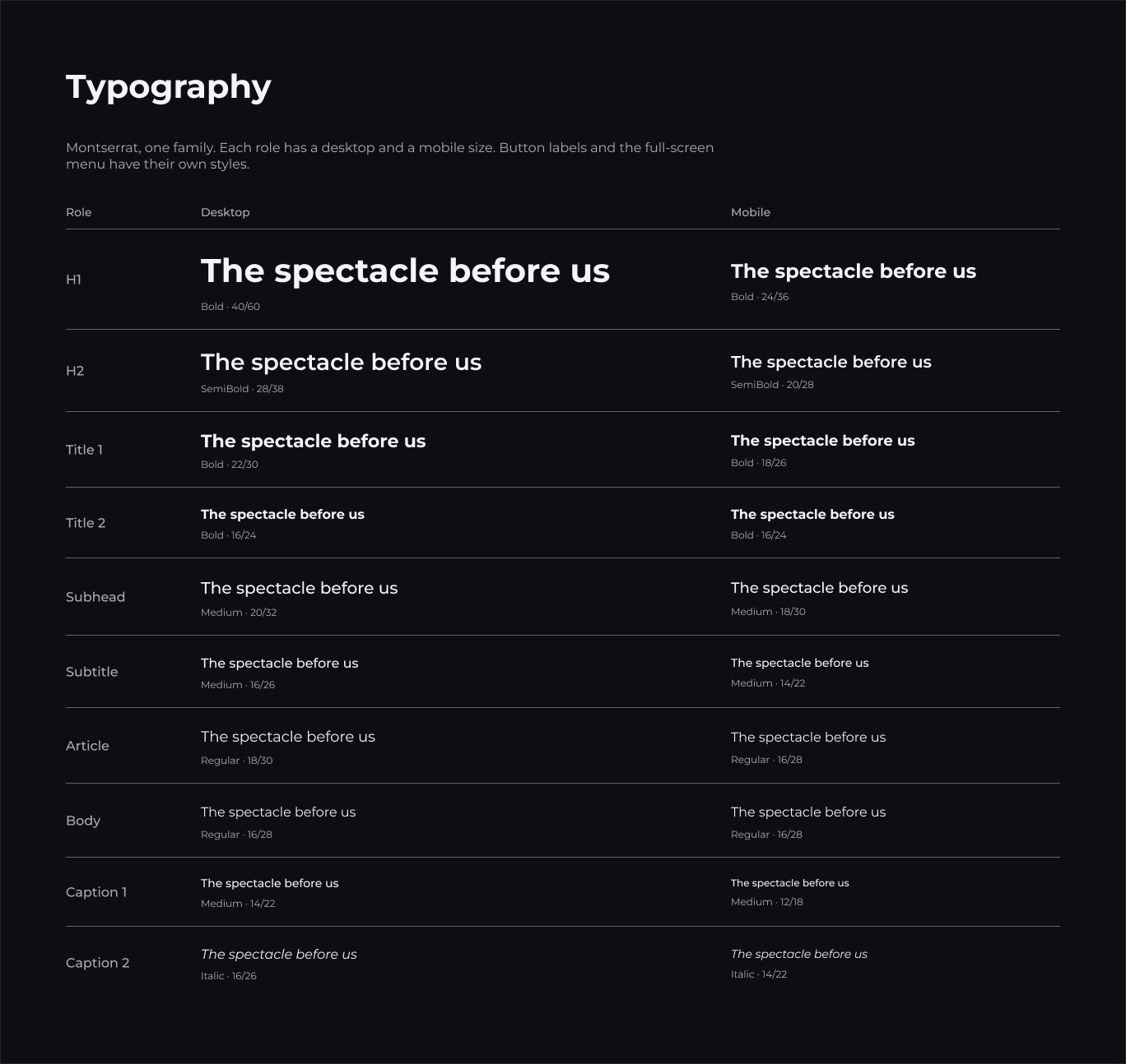
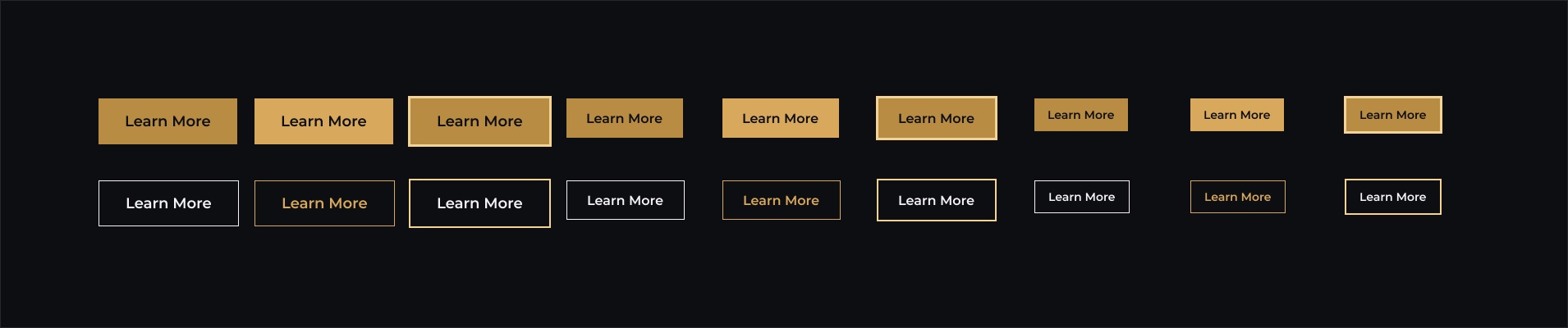
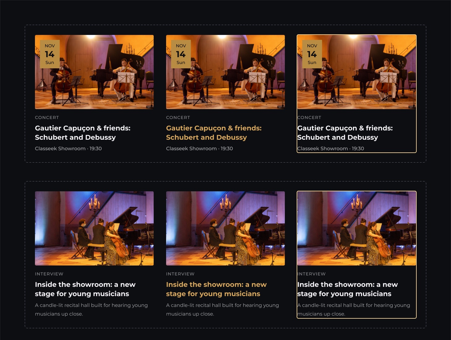
Desktop and mobile share one set of styles and components. One typeface, Montserrat, with a desktop and a mobile size for each role. Gold is for actions, violet glow for key moments. Components come with their states: hover and focus, plus error for form fields.
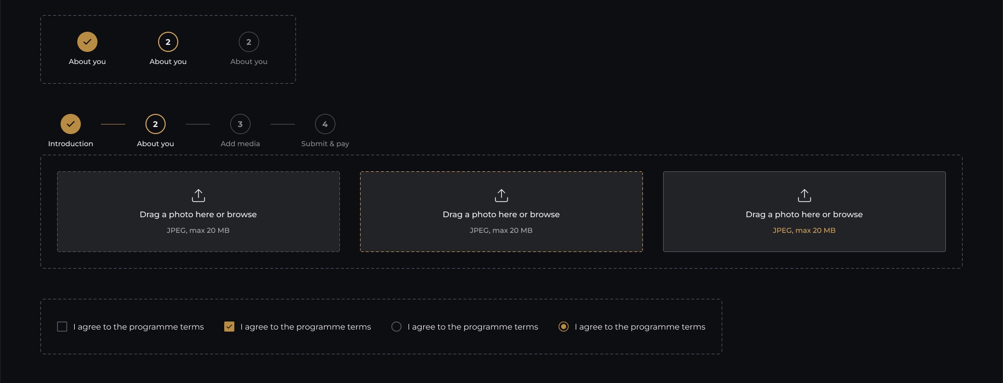
The stepper, upload and choices build every step of the application flow. Rebuilt in Figma in 2026 from my original designs.
Key decisions
Not every decision was mine to make. The navigation shows how I worked with that.
The product team pushed for it to please the CEO. It wasn't based on user needs.
Visitors couldn't see what Classeek offers at a glance.
I designed a dedicated full-screen desktop menu, repeating my diagonal line motif, to soften the impact.
In the refinement, sections sit in the header; the full-screen menu stays on mobile.
Opening the programme meant musicians without a nomination would meet Classeek through a form. Clear requirements up front, links instead of heavy uploads, and a review before paying.
Dark mode came from the atmosphere of the showroom and connects Classeek's physical experience with its website. I checked contrast so it stays readable.
I also designed Ambassador communications, recital brochures and posters, so I treated Classeek as one visual world instead of a website on its own.
Moving off Wix was about independence, so concerts, artists and stories share reusable cards and layouts.
Outcome and reflection
Classeek's in-house developers built the new site, and the team was very happy with it. Classeek has been featured in Gramophone, Bachtrack and The Violin Channel.
Classical music didn't need to be modernised by removing its identity. It needed the right light.
Press mentions: classeek.com, September 2026.